Video
Video can be one of our most effective tools to connect with the people we serve, amplify the Bureau’s mission, distribute information, and make announcements. It is a complex and multifaceted medium, requiring attention to every detail including story structure, composition, audio, color treatment, typography, timing, and more.
At the Bureau, we produce videos in a variety of styles and formats depending on the objective(s), targeted audience(s), scope, resources, content, and messaging for each project. We always strive to keep videos at the CFPB consistent and unique.
Types
Branded content
A custom-designed video that incorporates design elements for specific solutions. This type of video is usually consumer or industry facing and is representative of the Bureau’s priorities.
HTML code snippet
<iframe width="560" height="315" src="https://www.youtube.com/embed/B3LhSpxEW-o" frameborder="0" allow="accelerometer; autoplay; clipboard-write; encrypted-media; gyroscope; picture-in-picture" allowfullscreen title="Branded Content"></iframe>Documentary
This style utilizes interview footage and b-roll of real people. It can be used to communicate a personal, trustworthy aesthetic to a given message.
HTML code snippet
<iframe width="560" height="315" src="https://www.youtube.com/embed/YB_7cy1poGA" frameborder="0" allow="accelerometer; autoplay; clipboard-write; encrypted-media; gyroscope; picture-in-picture" allowfullscreen title="Documentary"></iframe>iPhone
Mobile videos are sometimes used for quick turnaround messages that are urgent in nature and provide a transparent look and feel that’s relevant.
HTML code snippet
<iframe width="560" height="315" src="https://www.youtube.com/embed/AcI3GDMVH5U" frameborder="0" allow="accelerometer; autoplay; clipboard-write; encrypted-media; gyroscope; picture-in-picture" allowfullscreen title="iPhone"></iframe>Educational
Educational videos help answer questions or explain complex ideas about specific issues, tools, regulations, and more.
HTML code snippet
<iframe width="560" height="315" src="https://www.youtube.com/embed/em6viyrSGCc" frameborder="0" allow="accelerometer; autoplay; clipboard-write; encrypted-media; gyroscope; picture-in-picture" allowfullscreen title="Educational"></iframe>Event
The bureau livestreams field hearings, consumer advisory board meetings, town halls, and more. After these events are broadcast live, we upload them to YouTube for documentation purposes.
HTML code snippet
<iframe width="560" height="315" src="https://www.youtube.com/embed/D8mS1tZMJ70" frameborder="0" allow="accelerometer; autoplay; clipboard-write; encrypted-media; gyroscope; picture-in-picture" allowfullscreen title="Event"></iframe>Use cases
Typically, we find video is best used to:
- Connect with people in an emotional or human way
- Make complicated concepts simpler
- Share information or help provide education
- Document live events
Guidelines
Preproduction
Every video project, no matter the size, requires forethought and planning. Preproduction is often considered the most important part of producing a video. This is where it all starts. During preproduction, we analyze the objectives and goals of a project, determine the audience, create concepts, develop a plan, determine the scope, and build a schedule for production and postproduction. At this stage, we determine the best way to present information to the intended audience and a realistic plan to achieve it.
Tone
One of the most important aspects of preproduction is establishing the tone. We prefer a natural, authentic tone, making sure to use imagery that does not feel staged or unrealistic, but rather true to the lives and situations of consumers. The tone should be welcoming, knowledgable, and authoritative without being demanding or overly complex.
Budgeting
Projects tend to vary in scope, and that will impact the budget. Budgeting takes place during preproduction and takes into account all expenses, personnel, and resources required to complete the project as planned. Therefore, it is essential stakeholders and decision-makers are transparent about their scope and needs so we can provide the best solution.
Scripting/treatments
Every video should have a script or creative treatment, even if there are no scenes or actors, to ensure everyone involved in creating the video knows the resources, concept, and overall plan being implemented. Scripts are usually written in a two column format, where audio appears in the left and visuals appear on the right.
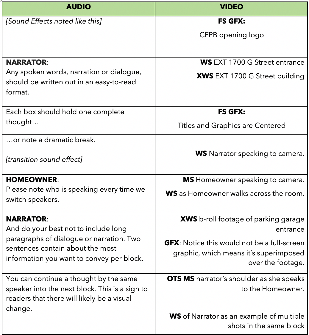
- Remember videos are a visual medium, so be sure to fill in enough visuals to appear on screen during the length of any narration.
- Include descriptions of text, graphics, icons, or animations you’d like to appear on screen.
- Keep your narration as short and easy-to-understand as possible. Try to avoid inaccessible technical or industry language and remember to keep your message focused and easy to understand. For complex topics, consider your audience and their needs.
- Keep your scripts relatable and attempt to forge a human connection.
- Avoid redundant or repeated information. Most videos should be short enough as to not require a summary of information already presented.
- Strive to avoid clichés and imagine unique, relevant metaphors, dialogue, and images.
- Keep the message simple. If you have several topics to cover, consider making several short videos rather than one long video.
- Ensure your script’s length is accurate and sounds natural by reading the narration out loud at the intended pace. Reading silently is much faster, and thus can give inaccurate length estimates. Reading aloud also helps you review the flow and word choice of the script in a fresh way.
Length
There are no specific length requirements for videos, but always try to make videos as short as possible. It’s important to keep the viewers’ attention. For most social media videos, try to stay under 3 minutes in length, but there’s no hard and fast rule for length.
Filming
We strive to capture footage that feels modern, high-quality, and follows professional best practices. For example, we’re mindful of the rule of thirds, manual camera settings, properly exposing images, color balance, smooth camera movement, and how sound relates to the image.
- Frame rates – We usually capture footage in 29.97fps or 23.97fps. If using slow motion, we will use a higher framerate, such as 60fps or 120fps (do NOT slow down footage in editing if it was not filmed that way, unless you’re trying to achieve a stylized look).
- Exposure – All footage should be exposed properly, meaning the subject should stand out from the background, there are no over-exposed white or bright areas, or under-exposed black or dark areas (details can get lost in the shadows). Try to avoid the camera’s auto settings, as that will create exposure changes during the shot, and the footage will change colors and exposure throughout filming. This makes color correction, exposure compensation, and other problems difficult for the editor to fix.
- White balance – This is also known as the color temperature. Ensure you set the correct white balance, so the image stays consistent and true to life. This is critical for skin tones to appear natural.
- Focus/depth of field – The subject of each shot should be in focus. When filming people, focus on the eyes. Try to use selective focus and depth of field to create a variety of visuals. Typically, when filming a person, use a shallow depth of field (person in focus with a blurry background) to isolate them within the frame. They will stand out more to the viewer. Use a deep depth of field (everything is in focus) when establishing an environment or providing context as to how a subject relates to the background.
- Camera movement – Moving the camera can draw viewers into the frame or serve a variety of artistic purposes, and typically elevates the overall quality of a video when done intentionally. Take opportunities to move the camera elegantly to visually tell a story or direct the viewer’s eyes. Ensure camera movement is smooth and not distracting. Filming in slow motion can help smooth out footage. In particular, when filming handheld, be sure footage does not shake or move too quickly unless you’re trying to achieve that specific look.
- Zooming - Avoid zooming during a shot. Zooms are artificial and do not mimic the natural way we see the world, and therefore often degrade the quality of a given shot.
- B-roll footage – Capture a wide variety of shots at every opportunity, even of the same scene or action. For each scene you should try to capture a variety of different focal lengths (close ups, medium, wide shots, etc.) and different camera angles. This makes your footage more interesting and provides options for your editor.
- Establishing shots – When filming, always try to establish a scene or a sense of location by getting a wide shot of the environment first. This could be a room, building, or other image that provides context. Typically, an establishing shot or wide shot will begin and end a sequences of shots when editing.
- Handheld footage – This allows a director of photography to capture a variety of shots quickly and follow the action. This is also known as ‘run and gun.’
- Camera angles – Seek out visually interesting, well-composed camera angles. This not only provides interesting visuals, it allows for a sense of depth to the image, ensuring shots don’t feel flat.
Framing
Always look at the whole frame. Try not to film a subject directly in the middle of a shot. Make sure to look at the top, bottom, left, right, and each corner of the frame when composing an image. Your goal should be to never crop the image in post. It should be framed correctly in camera. A video with perfect framing would mean each frame, if frozen, would appear as a well-composed photograph.
Term
Example
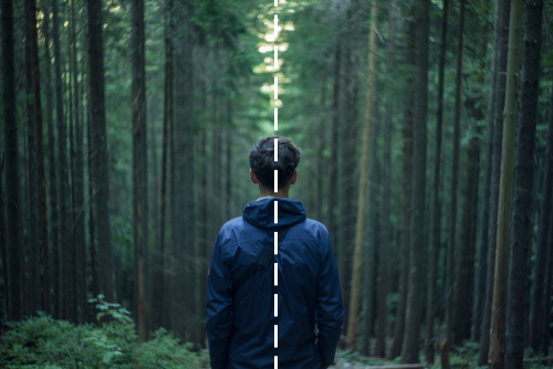
Symmetry
Symmetrical shots can be used to effectively draw attention to the center of the screen, create a dramatic visual statement, or express an aesthetically pleasing balance. Symmetry gives an image more thematic and visual weight than shots around it.
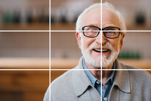
Rule of thirds
If one were to divide the screen evenly into thirds using horizontal and vertical lines, the focal point of the image would fall along the intersection of two of those lines. Visual lines, such as horizons or architectural columns, should fall along one of those lines. For most situations, adhering to the Rule of Thirds will help ensure proper composition, regardless of the subject matter.
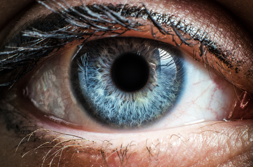
Extreme close-up (XCU)
A shot much closer than a typical CU, such as focusing closely on someone’s eyes.
Close-up (CU)
A shot that is focused on one particular object filling most of the frame. For a person, a CU captures their head and shoulders.

Medium shot (MS)
A shot showing the subject and a moderate amount of background. For a person, it’s a shot framed from roughly the midsection up. This can also mean a shot from the thighs up (known as the “cowboy shot”).

Wide shot (WS)
A shot showing an entire object within the context of its environment or background. For a person, this is a head-to-toe shot.

Extreme wide shot (XWS)
Also known as a “landscape” shot, this is a very wide angle used to show off landscape, buildings, or large spaces.

Head room
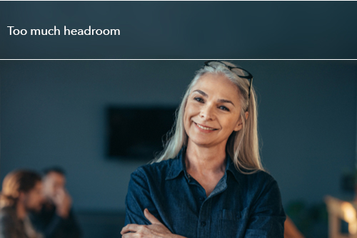
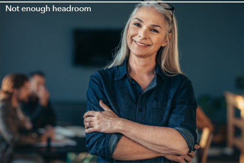
This is the amount of room between the top of a subject and the top of the frame. When filming people, be aware of leaving too much head room—which will make the subject unnaturally small—and too little head room—making the subject’s head appear “stuck” to the top of the frame. In general, placing a subject’s eyes on the top third line ensures proper head room.
Lead room
When an object or a subject is facing one side of the frame or another, there should be ample room in the negative space in front of that object, thus leading the viewer’s eyes in the correct direction. When in motion, the negative space should be where the object is headed, rather than where the object has been.
* For example, if a person is looking to the right of frame, they should be placed on the left side of the frame looking towards the negative space. If a bicycle is rolling from left to right, the negative space should be on the right side of the frame so the bike can roll into that space.

Framing note
Avoid framing people “at the joints”, such as knees, waist, and neck. Framing at the joints makes the subject look cut-off and unnatural.

Lighting
Our overall goal is to create natural-looking images with soft shadows, contrast, vibrant colors, and appropriately exposed subjects. Think of lighting as “painting the picture with shadows,” not just making things visible.
-
Three-point lighting – Traditional three-point lighting includes the following: a key light, fill light, and back-light (opposite of the key light). We adjust our lighting setup according to the constraints of the location by adding lights to the background, balancing the exposure based on what we can’t control, using a wide range of modifiers, bouncing light, or taking lights away.
- Interviews - Three-Point Lighting is particularly useful for interview setups and testimonials.
- Catch light – When lighting a person’s face, be sure the eyes are not shaded and strive to have a bit of light reflecting in the eyes. This is called a catch light or eye light. This technique will draw the viewer’s attention to the subject’s eyes. The catch light will make your subject look more intelligent, more alive, and more engaging. If the eyes are in shadow or under a hat, this may make the person look sinister or untrustworthy, so be sure a person’s eyes are well lit.
- Light color/temperature – We ensure all lights are the appropriate color temperature and match the environmental color temperatures where needed. The most common color temperatures are measured by Kelvin (or a ‘K’ value). Daylight (cool/blue) is usually 5600k and tungsten (warm/orange) is usually 3200k. If you don’t know the exact color temperature or don’t have access to a professional color meter, most cameras can capture a relatively accurate reading of the color temperature by using a white card.
- Soft lighting – Strive to make the shadows soft, giving shape and definition to your subject without casting harsh shadows. To do this, diffuse light using soft boxes, silks, or bouncing the light off a large white surface like a ceiling or wall.
- Outdoor lighting – We apply the same visual standards to outdoor footage and lighting as we do indoors. When filming outdoors, avoid direct sunlight, harsh shadows, and sunny, over-exposed backgrounds. Try shooting in the shade. Also, remember to shoot into the shadows to create an interesting shot. The sun can create an edge around the subject. This will add depth to an image. Choose angles, locations, time of day, and subject positions that provide enough light on both subject and background. Sometimes this can be tricky when working with time constraints. If shooting a person during a sunny day without shade, try using a silk or other diffusion to soften shadows and make the image look more appealing. If possible, try using lights outside that are bright enough to supplement the sun.
- Practical lighting – Very often, an environment will already feature practical lights such as interior lighting in office buildings or stores. If you cannot turn the practical lights off, you can use them to assist in lighting. Adding lamps, lanterns, or other lights to the background or environment of a shot can give it an extra sense of realness. We also use practical lights to “motivate” the lighting setup of production lights. When using practical lights, be aware of any flickering, rolling, or stuttering they may cause in the camera. This can sometimes be addressed by adjusting the shutter speed, and sometimes the only solution is to turn the lights off. Otherwise, rolling or flickering may ruin any footage captured. Always be aware of the color temperature of practical lights and ensure skin tones look natural. Avoid florescent lights that give the image a green or magenta color tone.
- No lighting – In circumstances when you don’t have professional lighting available, ensure there is more light on your subject than on the background, and try to use soft natural sources to achieve proper exposure. Avoid pointing the camera at large windows or bright spots directly in the background. Instead, use the light from that window to illuminate your subject. Using the environment is vital, and a combination of environmental and practical lights can create a natural, realistic image that is pleasing to the viewer.
Interview framing
Our on-camera interviews feature realistic but aesthetically pleasing backgrounds, need to be well-lit, and framed in such a way as to look trustworthy, professional, and with realistic contrast and exposure.
- Subjects either look off-camera or directly to camera depending on the message of the video. Looking off-camera feels natural and trustworthy. Looking directly to camera is for personal, direct messages.
- Pay attention to the eye line. The interviewer should be placed at eye-level with the subject.
- Have as much separation between subject and background as possible, and avoid flat walls, over-exposed windows or doorways, or distracting motion in the background. Often the corner of a room is the most interesting background in a plain setting.
- Search for interesting backgrounds. Avoid flat, featureless backgrounds. Try to frame interesting lines and angles in the background. Subtle touches of art or objects—such as a plant, award, or bookshelf—and textures or design elements of architecture go a long way.
- Beware of objects behind the subject’s head, such as lamps, door frames, or poles. This may make the subject appear to have an object attached to or sticking out of their head.
Two-camera interviews
When filming with two cameras, the color balance, frame rate, resolution, camera settings, and exposure should match exactly between cameras.
- The cameras need to have different focal lengths to allow for easy, seamless edits. For example, if Camera 1 is a close-up, Camera 2 should be a wide shot.
- Cameras should be placed on the same side of the subject and should not “jump the 180 line.” For example, if the subject is on the left side of the screen facing right in Camera 1, they should be on the left side of the screen facing right in Camera 2 as well.
Interview questions
When asking questions for an on-camera interview, always aim to capture the personality and humanity of the interview subject, rather than news-like sound bites.
- Try to avoid sharing questions with interviewees in advance. The natural instinct for most people is to memorize responses. This will result in an unnatural interview. If the interviewee needs to be prepped for some reason, provide a bulleted list of general topics or talking points. This will allow them to gather their thoughts or get the facts straight in advance.
- Make sure your interviewee provides a slate on camera—while recording, the first thing they should say on camera is their name spelled out, their title, and any other relevant “introductory” information. The producer and editor will reference this when organizing the video project.
- Try to establish a trusting rapport with the interviewee, keeping the interview conversational in nature and encouraging honest answers.
- Encourage interviewees to speak in complete sentences, sometimes repeating parts of the question in their answer or providing context. Ask yourself— Will this response make sense if the viewer doesn’t hear the question?
- Avoid asking “yes or no” questions or questions with one-word answers. Delve deeper into topics by asking “how” and “why.”
- Ask follow-up questions and feel free to go off script to keep the conversation flowing naturally.
- Ask questions that can be answered by expressing feelings and impressions, rather than simple facts. Get to the human element. For example, asking why a person is proud of an accomplishment or what the most challenging part of a project was, or how a certain action made them feel.
- If an interviewee is talking about numbers, data, or complex topics, encourage them to put their answers in a context the audience will easily understand.
- In most cases, encourage answers that avoid technical jargon or insider language (unless that’s the audience you’re speaking to).
- Ensure interviewees avoid self-editing, cutting themselves off, or making faces while delivering a line. Assure interviewees that even if one portion of their answer is wrong, they should complete their thought because you will be able to edit later.
- Try to encourage succinct, short, complete answers to questions rather than long stories.
- Do not talk over your interviewee or “step on their line.” Also, make sure they don’t talk over you. Try to give at least a second or two pause between questions and responses. This may feel unnatural, but the editor will thank you.
- Use silence to your advantage. Interviewees tend to want to fill that silence by adding additional information. If the interviewee pauses or if there’s a hesitation, let their response play out and listen.
iPhone self-filming
We often use iPhones for self-filmed testimonials or other information in order to respond quickly.
- Hold phone horizontal or vertical using a stand, clip, or other mounting solution to keep the phone in position without shaking or moving.
- Have subjects center themselves in the frame, facing a soft light source such as a window or light-colored wall. It is important to have even lighting on the subject’s face, and for the face to have more light than the background.
- Ensure the camera phone is eye-level with the subject, approximately an arm’s length away from the subject (usually a standard focal length), and with approximately four finger’s worth of headroom.
- Try to create distance between the subject and the background. Stay far enough away from walls or backgrounds so as to not cast a shadow.
- Make sure the subject’s location is quiet and use a lavalier or directional microphone if possible. Avoid covering the microphone and try to eliminate or minimize any background noises such as air conditioners, barking dogs, or traffic.
- Find a visually pleasing background, like a wall, room, or other surface that is clear of artwork or other personal items. Avoid backgrounds that are busy, cluttered, or overly bright.
- Strive to find a background that visually represents the message and tone you’re trying to communicate.
- Have subjects smile and deliver information with an optimistic tone, sit with proper posture, and remember to look at the camera lens, not their own image on the screen.
- Subjects should remember to provide “handles” by leaving 5 seconds of recording before they begin speaking and 5 seconds after they complete the take.
Wardrobe
Actors or interview subjects appearing on camera should wear appropriate, non-distracting clothing that lends itself to the overall aesthetic of the video. Usually, our talent will wear business casual, solid colors or appealing patterns. Tattoos may need to be covered with clothing, depending on the message and topic of the video.
- Things to avoid – logos or clothing brands, neon colors, solid white or black clothing, busy or tight patterns, or clothing with distracting or inappropriate text or images.
Hair and makeup
Actors or interview subjects appearing on camera should appear natural, well-kempt, and representative of the video. Hair should be clean and styled in a way that would be appropriate for a business interaction. Makeup should be minimal, aimed mainly at reducing shine, blotting perspiration, or subtly highlighting features like the eyes.
Audio
High-quality audio is incredibly important. We always emphasize recording and delivering the clearest, sharpest audio possible.
- When recording an interview or other on-camera talent, try to hide all microphones. This can mean hiding a lavalier mic out of frame, under a collar, within an open jacket, or even in a subject’s hair. But remember—clean audio is the most important thing. We will show a lavalier mic if it means better quality audio. Otherwise, we’ll just use the audio from a professional shotgun/boom that’s slightly out of frame, instead.
- If recording with a shotgun microphone, the best-sounding audio typically comes from aiming the microphone at the subject’s throat or right above the chest. Try angling the mic from above and slightly at an angle.
- Audio should adhere to broadcast standards, averaging around -12dB with peaking not to rise above -6dB.
- Use a windscreen if shooting outside or at a location with a breeze.
- Avoid ambient noise, electronic interference, or recording audio in locations that have echoes or distracting background noises.
- When filming b-roll, always try to record audio too. These natural sounds or sound effects provide the editor with more elements to make the video more engaging.
Voice over talent
Ensure clear, professional, well-spoken narration and voice over recordings.
- Use professional Voice Over Talent (VO) whenever possible. A coworker with a “good voice” does not necessarily have the professional training, talent, and experience to recite narration. Instead, search for professional voice actors with samples from previous work when selecting VO talent.
- VO recordings should be within broadcast standards, crisp and clear with no background noise or microphone pops, and it should be de-breathed.
- If you must use non-professional Voice Over Talent, be sure to record in conditions as close to a recording studio as possible. This means finding a quiet, padded or carpeted area where there will be no echoes, electric noise, or distracting background noises. In some cases, recording underneath a blanket or in a closet may give the best results.
Editing guidelines
Editing is key. It’s essential to visual storytelling and marries the artistic language of film to the technical considerations. Our projects are edited not simply to repeat information, but with an eye for messaging, presentation, style and technique. Edits should be dynamic and intentional.
- Ensure sequence settings are consistent with the footage and needs of the project. The CFPB typically shoots, edits, and creates sequences in 1920 x 1080 (or 3840 x 2160 if 4K), 29.97fps or 23.98fps.
- Videos should not be distorted (stretched or squeezed) in post-production or exporting and should conform to a 16x9 aspect ratio. Some 4K footage is not recorded at 16x9 and will cause letterboxes if not corrected in post.
- All cuts should be relevant, motivated, or in time with music or narration. Whenever possible, cut on the action. Each edit or transition needs a reason.
- Choose a variety of focal lengths, angles, focal distances, and framing. For example, do not use three medium shots in a row. This variation keeps the editing dynamic and visually interesting.
- Avoid using shaky shots, improperly exposed footage, blurry or out-of-focus images, and jump cuts.
- Either cut to the content or music (or both, for a dynamic edit). When cutting to the music, look for other visual motivations for cutting in addition to musical notes, thus varying the shot length and rhythm of the edit. Not every cut needs to be on the beat.
- Sequences or segments should tell a story. This is typically done by starting with a wide establishing shot, and each subsequent cut using a shot with a different focal length or action. Sequences typically start and end on wide shots, with the more detailed, closer shots in the middle.
- When converting footage to slow motion, do not slow down footage that was captured in 23.97fps or 29.97fps. Instead, convert high framerate footage (such as 60fps or 120fps) into the timeline’s frame rate.
Logo usage
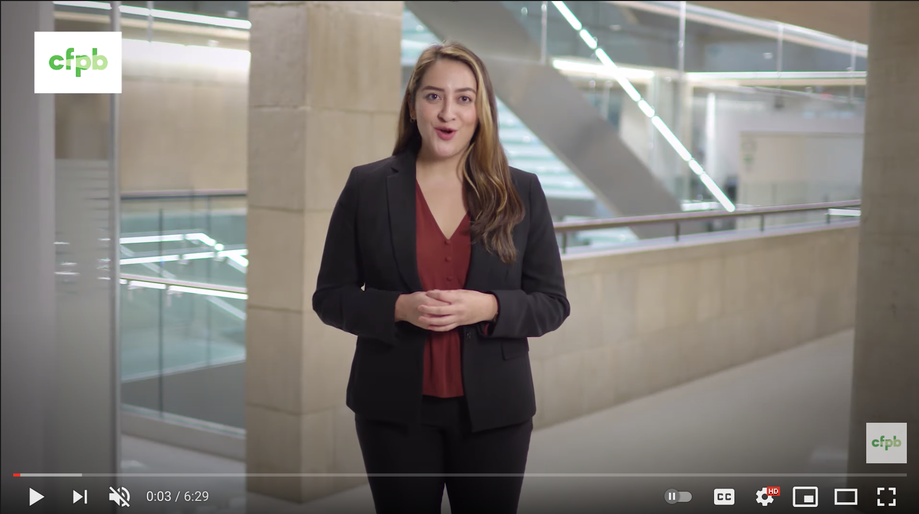
The CFPB adheres to our brand standards for logo usage. Within any given video, we use an animated version of our logo. This logo always appears over white and is always the same logo animation, whether used for the intro, title, outro, or within the video itself.

Watermark
Our logo appears as a watermark in the upper left-hand corner of any social media videos we produce.
Motion graphics
We often feature motion graphics in our videos, whether full-screen or superimposed over footage. Please refer to our Motion Graphics page for specific motion graphics guidance.
Music
Music is an incredibly important aspect of any video, helping to guide and highlight the mood of the piece, set the tone, and draw the viewer’s attention. When selecting music, ensure it is high-quality and cinematic, matching and underscoring the messages and themes of the piece you are editing.
- We strive to use music often, although sometimes a lack of music is more effective.
- Be sure music begins and ends on smooth notes. In other words, do not start or end a music track abruptly or without context, but rather find a musical transition, change in tone, or the ending of a measure or segment. This includes fading up and fading down during musical changes.
- Music should be edited to fit the length of the video or portion of the video where it is relevant.
Sound design
Sound design is another element we use to elevate our work and accentuate our storytelling.
- Use sound effects and “nat pops,” or natural sound pops, throughout a video to create a sense of realness, motion, and sometimes to draw the viewer’s attention to certain elements. These sound elements apply to motion graphics and animation as well as video footage.
Exporting formats
If exporting finished video, the export format depends on where the video will be shown or hosted. For most uses, we export a ProRes HQ file and an H.264 mp4 file for social media use.
Accessibility
Include text alternatives for non-text content.
For any content that is not text-based (images, audio, video, animations, charts, graphs, etc), provide an alternative version of that content that is text-based.
- Provide transcripts of audio and video recordings.
Provide alternatives for multimedia.
Multimedia such as audio, video, and animations will usually require more than just descriptive text. In most cases, the timing of text and descriptions in these files is important and should therefore be incorporated in an accessible manner.
Prerecorded content
- For audio-only content, provide a transcript of both spoken words and descriptions of other sounds.
- For video-only content, provide an audio track or transcript that describes the video.
- Combined audio and video content should accommodate alternatives for both (e.g., closed captioning or sign interpretation for audio, and an audio track or a screenplay-like document that transcribes dialog and descriptions of sounds and action for video).
Create open caption and closed caption files.
For any content that has spoken audio, we provide captions for accessibility. The choice between open caption and close caption depends on the platform through which we will be showing the video and the particulars of the project.
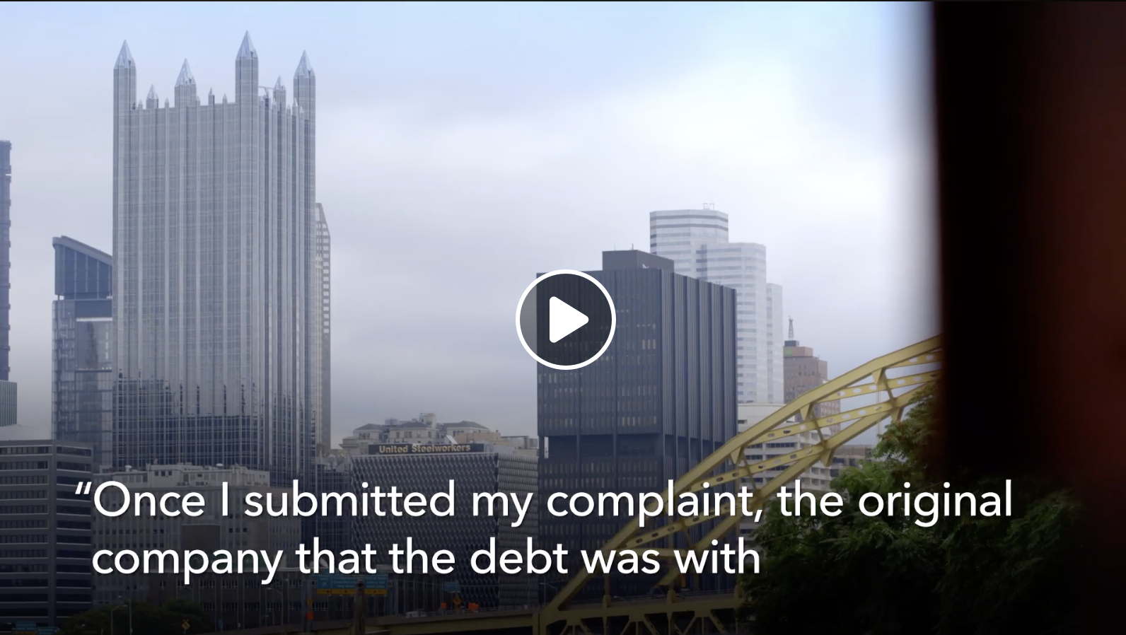
- For open caption files, we strive to make the text easy to read, clear, and within our brand standards by using our fonts, weights, and colors.
- For open captions we can also use the on-screen text as a design element, and may use colors or background shapes to highlight important messages.
- For open captions, if the video will be too bright or otherwise make text difficult to read, we use a rounded rectangle at 50% opacity beneath the captions in order to make it most legible.
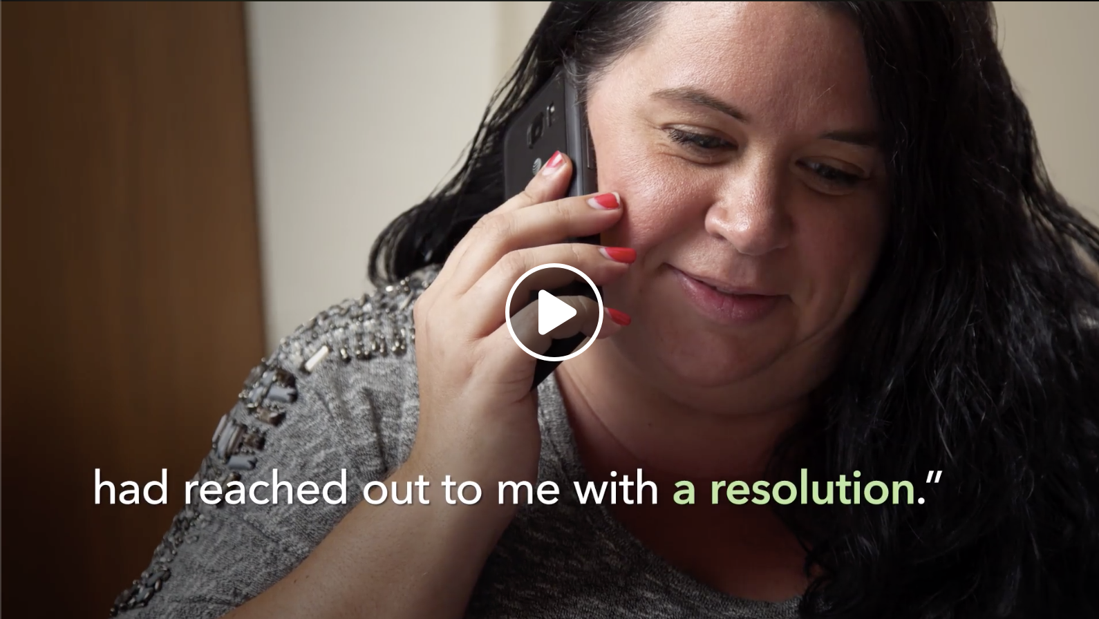

- For closed caption files, unfortunately you are unable to change the font, weight, size, color, etc.
- For closed caption files, it is our best practice to upload an accurate version of the transcript instead of using auto-generated transcripts.
Live content
- Closed captioning or sign language interpretation should always be available, but in some cases providing the prepared remarks or script alongside the audio/video may suffice.
Make content easily distinguishable from its surroundings.
These guidelines help ensure that content is perceivable for sighted users.
Audio
- Avoid auto-playing audio. If this is absolutely unavoidable, provide a control that allows the user to stop the audio and adjust or mute the volume.
- In recorded audio, background sounds should be at least 20 dB lower than foreground sounds and speech. This does not apply to music.
Do not create designs or interactions that may cause seizures.
- Nothing on the page should flash more than 3 times in 1 second.